
During this uncertain lockdown period for him COVID-19, we try to get information from experts and from every government, around the world. The information and instructions should be as simple and accurate as possible to ensure that everyone understands and follows them.
But let's see what happened on May 10, when Twitter account of Prime Minister Boris Johnson released a series of "infographics" that probably cause concern.

So far, the charts are still there available and no explanation has been given.
The purpose of the graphs was primarily to present the idea of "COVID alert levels", which range from one (when o Covid will no longer exist at United Kingdom) to five (risk of health care system collapse).
The graphics are nice, but unfortunately, they are almost useless.
To begin with the choice of a scale from one to five is quite arbitrary. Of course, the choice of scale is subjective and aesthetic, and does not apply to the real thing problem. When you analyze the graphs and the equation behind these things get very dark.
Let's look at the amazing equation
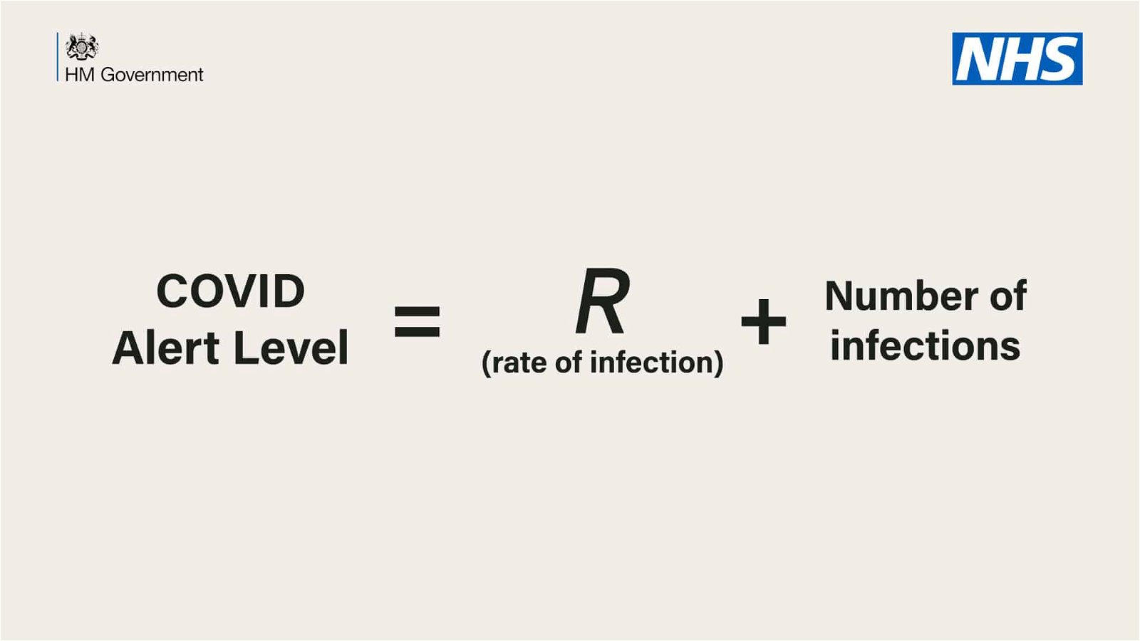
The level prenotices is explained by the above equation: “COVID alert level = R (infection rate) + number of infections.”
Unfortunately, the equation is nonsense for a number of reasons. To understand why, let's look at something we call units.
You may have been asked by your teacher at some point in elementary school to use credits in your answers. For example, an answer to a problem could be "three apples", "three meters" or "three years". Your teacher was trying to teach you the importance of understanding the units. That is, you can not add values that do not have the same units, for example, "three apples + three meters" does not make sense.
This shows us the fundamental error of the government equation, which tries to connect the following three parameters.
1. The warning level, which is a number without a unit between one and five.
2. R, which is described as the "rate of infections" in the equation. Depending on the definition used (this is not very clear from the context) it could indicate how many people are infected in a given period of time. This is supposed to be a percentage, and if we want to make it units we have to refer to it as "people per day" or just "per day" and that is not clear. In science, however, R is usually not a percentage but a count of the number representing the average number of people infected by each patient.
and 3. The number of new infections to be measured in human units.
Sounds logical. We want an alert level to be based on these factors. However, you can not just add them. You cannot add person units per day plus people and receive a number without a unit between one and five.
Depending on what R stands for, it will be small, probably somewhere in the region of one, while the number of infections will be somewhere in the thousands. This not only means that adding R is not related to the sum, but it also means that the level of warnings will be except of the scale of 1 to 5, and will reach the thousands.
Now let's move on to the chart below, which shows information on the steps to unlock. We see a curve with a bell that decreases slowly and suggests steps to facilitate the lockdown in its course. But there is no relationship between the steps in the graph and the level of the warnings, so we have to ask ourselves what the equation is.
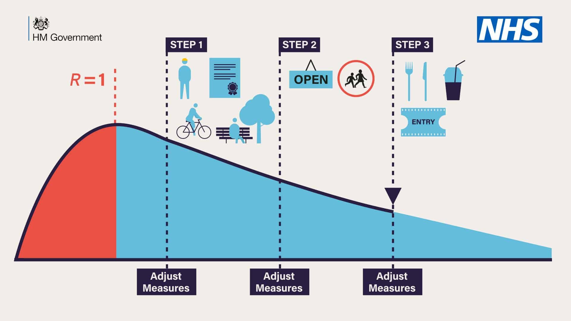
In addition, the vertical (y-axis) and horizontal (x-axis) of the graph do not have a number. So what is the information presented in the graph?
A safe assumption is that the x-axis is time. But are they days, months or years? This is very important because if we assume that the red part shows us from January to May, then the blue part of the curve probably covers almost two years. Since there is no numbering, the interpretation of what red means and what blue should probably concern us.
And what is the y-axis? We could assume that it is R since a value of R is given at the top of the curve. But why choose one to design the R and not something more comprehensible, say the number of cases? So the lockdown was imposed because R became bigger than one. However, the graph shows that R was at its peak, even though R was higher than one in the previous interval. Again this confuses the public as to what R. means.
Of course, graphs try to be explanatory, conveying general and simple ideas, rather than accurate data. However, at a time when every government wants to instill confidence in their information and expertise, these numbers just make things worse for those who know how to read charts. They cause confusion and inconsistency in their "science-driven" messages.
This article was republished by The Conversation. Written by Thomas Woolley, Lecturer in Applied Mathematics, at the University of Cardiff with Creative Commons license.

math "stupid-19" IQ, ie "cuts-19" IQ in mathematics