
Android lets go of carbs and says goodbye to sugar. The last information για το brand name, που παρουσιάστηκε σήμερα από την Google, φέρνει ένα νέο logo and changes sweets with numbers.
So let's talk about the logo. The old one robot "bugdroid” είχε μια μικρή χειρουργική επέμβαση και τώρα εμφανίζει μόνο το κεφάλι, και όχι ολόκληρο το σώμα όπως βλέπετε παρακάτω:
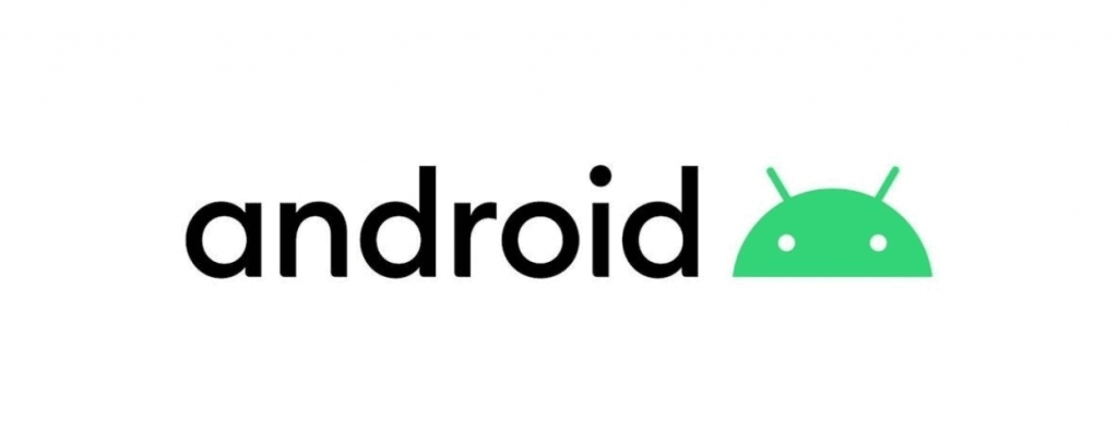
Likewise, the word Android uses a slightly thinner font. As with the previous two logo changes, each letter it's nonsensical.
Basically, the new Android wordmark will always be attached to the new logo and will never appear alone. At least, not in an official context.
If you're curious about what changed, Andrew Martonik at Android Central has made an incredible deep dive into the new rebrand. It's worth reading, if you're a designer, who considers every small change to be huge and very important.
But let's go to the upcoming Android nomenclature. Starting with Android 10, Google will stop using the names of cookies it has been using for so long.
Although confectionery names are important and are not as easily forgotten as version numbers, (4.4, 7.1 etc) there are obviously fewer names that have cross-cultural recognition for a globally recognized product such as Android.
Unfortunately, nothing replaces these names. So Google announced that the next version of Android (code-named Android Q) would be simply known as Android 10.
Those who do not agree with the change, Google plans to keep the Android statues at the entrance to the "Googleplex", according to David Ruddock of Android Police.
Watch the video
________________________
- You've drank microplastics but don't worry, at least not yet
- Botnet cannibalizes other shells more than a year
- Create a new virtual desktop in Windows 10
- How to Remove Spam From Your Wi-Fi
