
Her Maps Google they add the COVID-19 layer, which will allow you to see all the critical data of the spread of the coronavirus for specific regions.

Google announced today a new layer on its Maps, which will provide critical information about the number of COVID-19 cases that have been read in a given region. The goal of the new feature is to help them users to understand the prevailing COVID-19 situation in an area before traveling there.
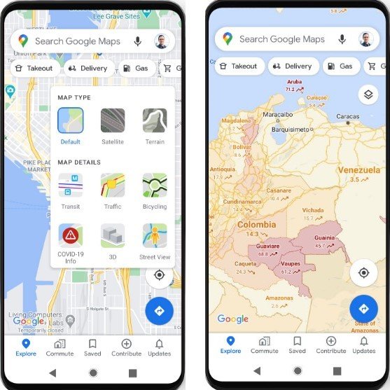
Η service it hasn't arrived on mobile yet but you should expect to see it within this week. Google Maps users will be able to see a color-coded representation of areas with new cases of COVID-19, per 100.000 people, with a seven-day average. There will also be a label showing if the number of cases is increasing or decreasing.
The data will come from a variety of sources, including the Johns Hopkins, New York Times and Wikipedia. These organizations, in turn, receive their data from local and intergovernmental organizations, such as the World Health Organization, government health ministries, state and local health services, and hospitals. Most of these sources already provide information in Google Search.
Maps will display national data in 220 countries and regions where the navigation application is available. Information at city, state, county or county level will also be visible, where possible. The new level will be released on Android and iOS worldwide.
To see it you have to go to Google Maps and press it button levels in its upper right corner screen and click on “COVID-19 info”.
