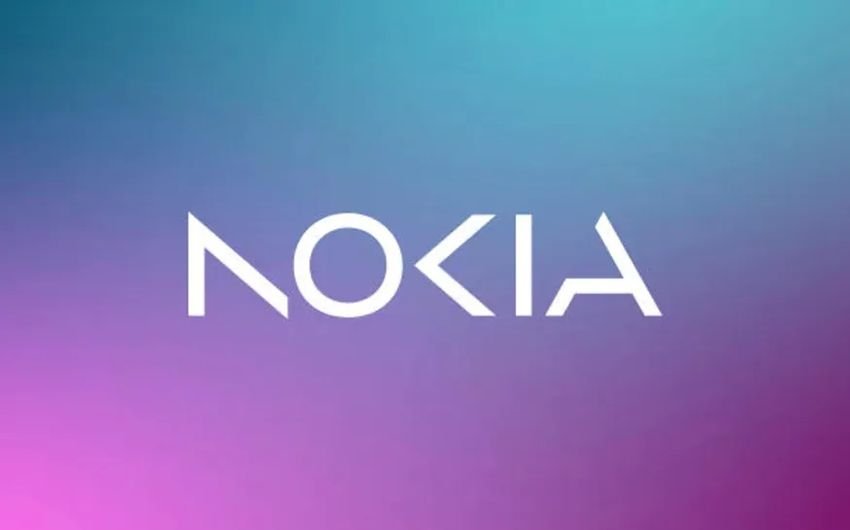
This is the new Nokia logo. For the first time in nearly 60 years, mobile phone giant Nokia is changing its iconic logo.

On Sunday, before the official start of the Mobile World Congress in Barcelona, the company unveiled its new logo. Gone is the iconic font and 'Yale blue' that defined its previous logo, and the company has adopted a more modern and more digital look.
The Nokia company said about it on a blog: “We are updating our strategy and, as a key factor, we are also rebranding to reflect who we are today: an innovation leader technologys business-to-business, pioneering the future where networks meet the cloud.
And respectively, CEO Pekka Lundmark he reported to Bloomberg: “In most people's minds, we're still a successful mobile phone brand, but that's not the point. We want to launch a new brand that will be very focused on networks and industrial digitalization, which is something completely different from the legacy cell phones phones".
Nokia is trying to forcefully re-enter the mobile phone market. After its disastrous acquisition by Microsoft for $7 billion in 2014, the company HMD Global, που αποτελείται από πρώην στελέχη της Nokia, απέκτησε τα δικαιώματα χρήσης της επωνυμίας Nokia για smartphone και tablets and launched her campaign with odd timing.
The company announced its latest device, the G22, just one day before today's announcement, which features the classic Nokia logo!.


