The Bing search engine got a different logo as Microsoft continues changes to the icons her.
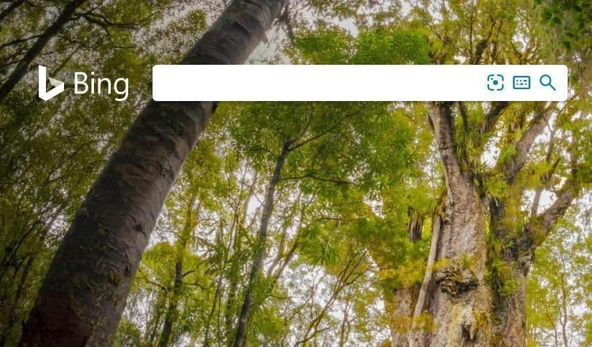
Microsoft is testing a new logo for the Bing search engine. It is already in the air and you can see it on its home page.
The new logo has no sharp sharp corners, looks more three-dimensional and looks more natural. On the results page of a search it still shows better, as it appears in dark gray on a white background.
The truth is that the new logo is more attractive, compared to the old neural variant.