
See a historical overview of Windows icons from version 1 to version 11.
Windows has dominated the last few decades as an operating system system on home computers. The oldest of you have lived their entire journey, starting from 1985 until today. With the arrival of Windows 11 we wanted to remind you of the history of the operating system through its icons.
In this historical background you will understand the technological development of screen resolution, color depth and graphics in general. Imagine that we start from the time we played the game Asteroid and end up in today's games that are close to the graphics of the movies. Let's go see them:
Windows 1.x (1985) and Windows 2.x (1987)
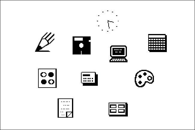
In the first two versions of Windows, application icons only appeared if you minimized a program to line εργασιών στο κάτω μέρος της οθόνης (στα Windows 1.x) ή στην surface εργασίας (στα Windows 2.x). Τα εικονίδια ήταν απλές ασπρόμαυρες pictures which had a size of 32 × 32 pixels.
To run an application in Windows 1.0 or 2.0, you had to select a file name from a list that existed in a program called "MS-DOS Executive". MS-DOS Executive did not display icons, only file names (something like typing "dir" in DOS). In those days, Windows served as a basic graphics shell over MS-DOS, so the basic file list made sense, even if it was not visually appealing.
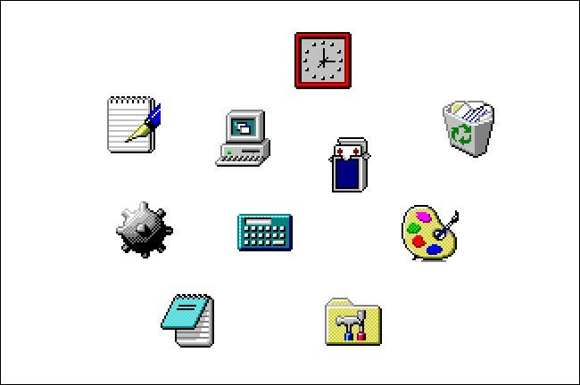
Windows 3.0 (1990)
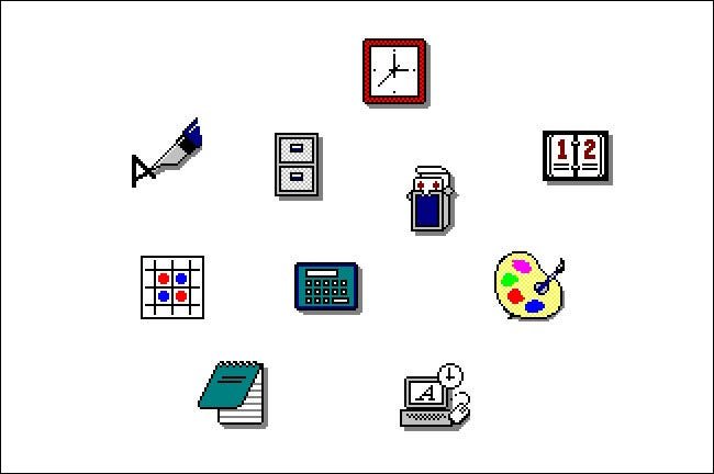
In Windows 3.0 the color has finally arrived. Do not imagine anything big, just the icons contained 16 colors and their resolution remained at 32 × 32 pixels. Microsoft then created the icons as "3D" as it had simulated shadows to make them look three-dimensional. These icons were designed by artist Susan Kare or who also created the Macintosh icons.
The truth is that for the data of the time the Windows 3.0 icons were a big step towards the presentation of the operating system. The color and feel of the three dimensions made them attractive and laid the aesthetic basis that Microsoft would use in future releases and applications.
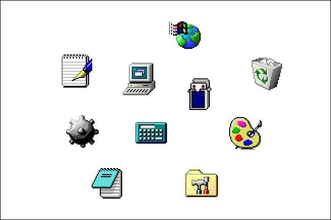
Windows 3.1 (1992)
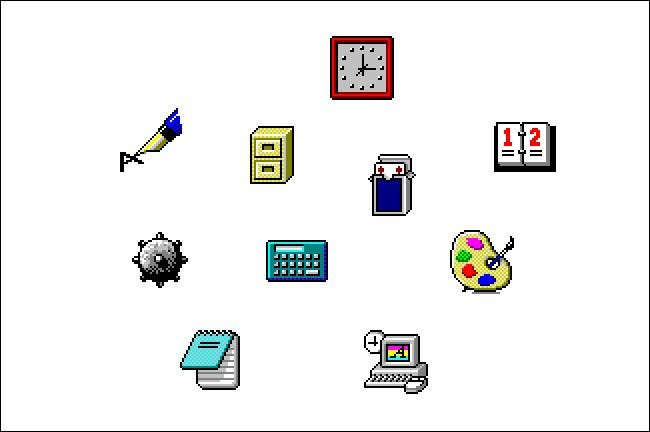
The dithering effect has been added to the Windows 3.1 icons to simulate the third dimension as much as possible. Technically nothing changed as they continued to use a resolution of 32x32 pixels and only 16 colors, but the sense of depth improved.
The dithering technique is essentially adding noise to a photo in random places to make it look more real. And when we say "noise" in the technique of photography we mean the distortion of color per pixel, especially in large patterns. Pay attention to the yellow color on the palette with the brush and you will see that it is not a single yellow but "it has noise".
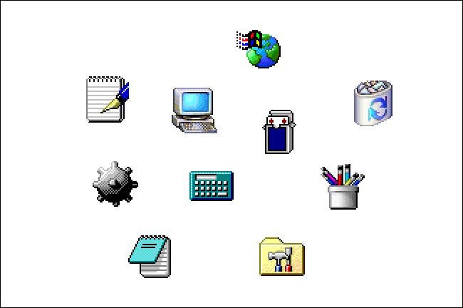
Windows 95 and NT 4.0 (1995)
In Windows 95 in most icons the resolution remains 32 X 32 pixels with only 16 colors, and with a change in their graphic appearance. But for the first time, the Win32 API appears with support for 256 × 256 pixel icons with 16,7 million colors.
Then with it additional package Plus! you could enable 65.536 color icons, which Microsoft called at the time high color. In fact, this feature was not used by many Windows 95 users. Windows NT 4.0 was released in 1996 and effectively brought Windows 95 into the NT family.
Windows 98 (1998)
Here things take a big step or if you want we come off the resolution of 32 X 32 pixels. Windows 98 comes with 256 color icons by default and 48 48 32 pixels. Some of them remained in the poor resolution of 32 X XNUMX pixels.
High resolution screens (for their time) also appeared at this time, although they were not affordable for everyone. Some icon designs, such as My Computer and Recycle Bin, have changed their appearance, though most have remained the same as Windows 95 and 3.1.
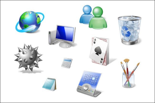
Windows 2000 and Windows Me (2000)
Like Windows 98, Windows 2000 came with 256 color system icons, which were available in 32 × 32 and 48 × 48 pixels. Several large desktop icons have once again taken on a facelift, with more detail and color depth. Windows Me used most of the icons with Windows 2000.
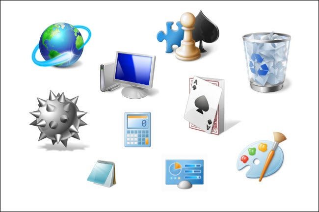
Windows XP (2001)
Windows XP first supported 32-bit icons (16,7 million colors). The graphics took off, and the icons got a translucent shadow, they had a greater inclination for a greater sense of depth (about 3/4), as well as curves at their edges. As with Windows 2000, most XP system icons were 32 × 32 or 48 × 48 pixels in size but with much more color.
As far as design is concerned, the XP icons made a fresh start, giving Windows a new style. Windows XP was considered the most successful version of the operating system to date, and complete refresh and icon quality played a role.
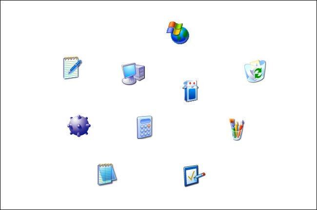
Windows Vista (2007)
In Windows Vista, Microsoft included a new Aero interface that emphasized glossy translucent effects and shadows. For the first time, Windows appeared with a set of 256 × 256 pixel system icons. However, the set was not complete and so if you used small icons in Explorer, they were essentially the same on a smaller scale.
Microsoft was accused of trying to copy the icons of Mac OS X. However, Vista was generally a failure and we quickly moved on to the next version, Windows 7.
Windows 7 (2009)
Windows 7 used most of the same icon set as Vista, but changing some of the basic icons for programs such as Control Panel and Microsoft Paint. Several revised icons have a smoother, more direct look, less glossy than Vista.
Windows 8 (2012) and Windows 8.1 (2013)
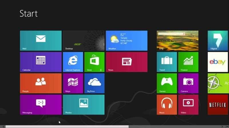
Windows 8 had a completely radical look design. The Start Button was missing and a new type of icon called "Tile" appeared for the first time, allowing dynamic information updates within the tile itself, on the home screen.
In Windows 8.1, the Start button reappeared and many application icons became simple white silhouettes of objects or shapes on a solid, colored background.
Windows 10 (2015)

Windows 10 contains the Tiles icons of Windows 8, while File Explorer also uses icons from both Windows 8.1 and the Windows 7 era. slopes.
At some point in 2020, Windows began to be released new application icons in the Microsoft Store who abandoned the flat, angular appearance of the Tile, in favor of the more colorful icons with a more rounded design.
As of today, the Windows 10 icon set is still a huge mixed pool of at least three or four different icon styles transferred from older versions of Windows.
Windows 11 (2021)
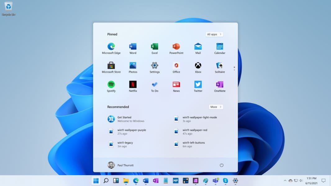
In recent years, Microsoft has been experimenting with a unified set of brand new icons for Windows 10. It looks like these icons will be released in full version with Windows 11.
Windows 11 will probably completely abandon the concept of Tile in Windows 8 and 10 and will have more depth and color. So far what we have seen is a flat animated look with low detail. With the advent of the standard version of Windows 11 we will see the final result.
