

1. You forget the fonts
One of the most common mistakes one can make is to deliver to the pro departmentprintingof a job, which does not contain the fonts used in the document. Of course, one would wonder why anyone would hand over open files in 2008. Let's not forget that there are (and rightly so) creative agencies and advertising agencies that prefer to outsource the chroma corrections and overlays of the final, high-resolution images to their final works in a Graphic Arts studio. So, the need to deliver open files, under certain workflows, is to some extent justified.
Also, many times new designers submit open work to be sure a more experienced eye will catch a mistake before printing. In any such case, the document should, either manually or automatically, be accompanied by all the fonts used in it. Professional pagination programs have the ability to "package" the document with everything necessary to accompany it - including all the fonts.
If we do not use a layout but a drawing program again, then again we can see from a relevant menu how many and which fonts are used and pack them manually.
A final solution is also the conversion of all text into linear contours. By all means and means, we must ensure that when our work is open to your external partner, it will remain unaltered. The only obstacle to the open file issue is the copyright of fonts. If you have any questions or doubts about this, we advise you to contact your font design house.
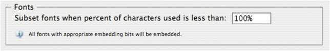
But even when talking about a closed file, either for eps or for pdf, we need to ensure the integration of our fonts into the generated file. Any software that respects itself gives the user this possibility.
2. Unwind the colorless assemblies
Color trapping (literal translation of color trapping) or color matching is a very large and serious chapter of Graphic Arts. Essentially, it stems from the fact that according to duration of a print it is expected and normal for there to be a deviation of color coincidence - what we call loss of coincidence or as we simply say in the printing press "the tins are gone". This phenomenon is created either due to the pressure or the tension exerted on the paper by the rollers, the absorbency of the paper, shocks and vibrations, whether the production line is in 2, 4 or 5 towers, the printing speed, the type of printing, paper feeding, film or sheet production, etc. Of course, during production, this is to some extent controlled. However, it will happen and when it does, in some cases the effect is imperceptible to the average observer and in others it is obvious.
As production and printing grow, as the print speed increases, as we move away from the sheet feed offset and go through cylindrical, flexographic and rotogravure printing, depending on the printing material and its use, the margins of non-collision of colors increase. This phenomenon results, on surfaces that are covered with solid colors, sometimes leaving white voids between them, and at other times one color affects the other agent undesirable impurities.
Speaking of solid colors, we mean 4 colors in 4 color in pure but overlapping areas (eg blue or magenta only) as well as custom colors such as Pantone. What we call color matching is the technology that allows us to predict the areas in which this phenomenon can occur and to cause us a controlled and constant admixture of pure colors in very thin zones where they are nearby. This essentially creates a trap zone for those colors that will deviate from the normal surfaces they would have to cover.
The assembly can happen automatically or manually from the software we use with special settings or from the graphic art studio we are working with.
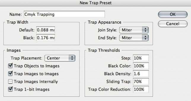
At an atelier level, we are talking about In Rip Trapping when the software used to rip our work has a built-in or separate module specifically for assembly. If this is not the case, a snap solution is to integrate third-party software that performs color matching procedures.
However, there are several instances of assembly that must be carried out by the designer himself. The most classic of these is the use of black and the use of pantone inks. For example, we should seriously think about how to deal with black letters or black linear patterns on images or spotty backgrounds. With the same logic you should think about how to deal with white lettering hole on 3color gray or 4chromatic black. In these cases, the extent to which we know the potential of the design software we use and the proper education we have plays a very important role.
One can refer to CMYK #03, where Michalis Kaloudis writes analytically and explains everything about the color matching both the theoretical and the practical level. For my part, I would like to inform you that in the next issue I will deal specifically with black and its proper use.
3. Remember the quadruple
Another very serious problem is delivering open or closed files with forgotten RGB files. Be careful, so that there is no misunderstanding, let's make something clear from the beginning. It's one thing to accidentally embed RGB images in a document where everything else is CMYK, and another to have a pre-designed workflow based solely on RGB images. Personally, I am an advocate of keeping the RGB character of the images throughout the workflow by converting the images to CMYK when closing in pdf with the correct color profiles or inside the RIP - if we are talking about a workflow with In Rip Color management . The advantages that such a scenario has over early conversion of images to CMYK are truly numerous and invaluable.
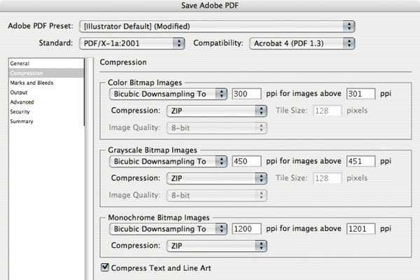
Since we've decided to deliver a file with all our linear images and images to CMYK, we're required to check our records before sending them to pre-press. Control mechanisms in such cases exist too many in all programs, either design or scrolling. We recommend you again if you do not know how to read your software drivers carefully or ask your colleagues. Professional paging programs provide the ability to control all document files at any time. The same is done when the files are left for packing and sending as open. And design programs have the ability to give us information about the types of files they contain. But even if we close our work in pdf, we can through Acrobat Pro make a pre-print control, a preflight of our work.
But it is not only the problem of RGB images that should concern us, but also how we make our black and white images, how to convert a picture RGB to CMYK, i.e. with what percentages of black, what GCR and UCR.
Regarding the last issue, we have been hosting a great tribute to the magazine's #07 issue.
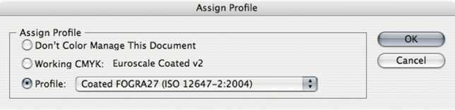
For example, if I convert an image from Grayscale to CMYK, it will not keep black as an ink, but it will be replaced with 4 ink levels. So it's big and serious, so, the color space I use for each file, whether it's RGB, Grayscale, or CMYK. And since I'm using CMYK, which CMYK is that? Do I have the appropriate color profiles? And when I convert from one CMYK to another, what changes will happen to the colors of my image? What color profiles did my Photoshop use? Do I use profiles of American newspapers while I print on European level?
4. Latent end-of-life images
Here the pain of preprinting techniques is great and many have seen their eyes. With no intention of hurting anyone, literally everyone can set up a piss, throw in a Quark and Photoshop and start doing whatever they want. Ρμαρτον Κύριε!
And well these cases. When we talk about paging in Photoshop? When we talk about setting up a book in Microsoft Word? When receiving files with gif images from the Internet at 72 ppi and with animation? Sorry if I're exaggerating, but some things need to be addressed. Take a walk from an atelier, sit for an hour or two and you will see…
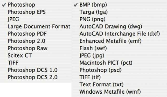
There is a very specific set of file types we use in Graphic Arts and these are pdf, eps, ai, cdr, qxd, ind, tiff, psd, jpeg. They are neither gifs nor picts, nor bmp, nor wmf, nor what we find on the internet at ultra-low resolution and we want to do 500% magnification.
Whether we're talking about scanning images, downloading with a digital camera and editing in Photoshop, we must first know the use of the images to get the right file type. The same happens with linear files and so on.
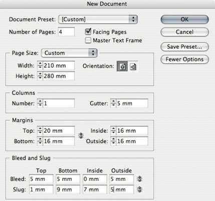
5. Delivering work on subtle dimensions
The first thing that someone has to do before deciding to think about the artwork of a job is to think about paper size, form geometry, cashew. Here things are serious enough.
There is not a few times when a job has been printed and then it has become a paper warfare (confetti) because the production manager or the graphic designer did not predict the use of the form from the outset. And I explain: The choice of paper size has 3 key axes. Economy, application and aesthetics. In short, we are interested in a work whose shape and dimension will make it stand out from the competition. We are interested in the size of the printout - reproduced in our print shop in such a way that we have as little paper waste as possible and thus saves time and money for the customer.
Finally, we are interested in having predicted the correct dimension of the paper - a dimension that is consistent with the usability of the printout and its conditions of use.
For example, a wrong paper selection in a subscription magazine may mean an increase in its weight, where from one point onwards it translates into an increase in subscription costs due to packaging and shipping.
Also, a wrong dimension of the form may make the form useless, since it will not be able to enter any promotional display in a customer's exhibition stand. Even a simple business card, if designed in the wrong dimensions, will become big enough to fit in no wallet. A book, if designed with a very large number of pages and a small width, can not stand alone on a table. Also, if the distances from the back are small, the reader will not be able to read the text correctly. Correspondingly, in a booklet with a large number of pages, if the bookmarks on the outside of the pages are not airy, it is certain that they will be cut as we approach the center of the form.
Apart from the issue of the wrong dimension of the document and the unsatisfactory margins, sometimes the designers start with a totally wrong dimension when setting up their papers. Other times, they give the right dimension, but others give the dimension of the net plus the bits.
6. That's the links of your idols
When we import different types of files into our document, whether it's in a drawing program or in a layout, we have two options:
The first is to bring these files into our document as a standard quality (or high) preview of the original Link file.
The second is to come in and integrate into our document-embed archives.
We have a problem when this document (open or closed) reaches the atelier with some of these files missing. And it is a matter of purely management and tactics, that is, how neatly one man makes his dossier of work and manages his work from the beginning.
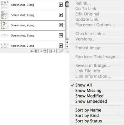
Let's first look at what assets and disadvantages each of them has. When we have all of our files as Link, then each time one of these external files undergoes a differentiation or a correction, they are reflected directly in our document either automatically or after we update the changes. Our document is not burdened by a volume of all the files we have imported and so it is light enough, so we do not burden the disk or system resources. On the other hand, if a file is accidentally deleted or moved or changed, then we have a problem. We will need to reconnect the file with the new name or new location with its image in our document. But if we have accidentally lost or quit the document, then we can not do anything anymore.
Assuming now that everything is Embed, it means that our files are all embedded in our document. Whatever the external records are, we do not care, as our work will not be affected at all. Also, if we want to send the file somewhere open, this is an ideal case because we will only send a single file and not files with Linked Files.
On the other hand, if we want to make a change to an image, we need to re-link the image with the external one that was changed and then Embed again. Also, the weight of our file grows as much as we do Embed new files, causing the disk to burden both the volume of files in a folder and the volume of files inside our document as embed files.
In my opinion, usually the Linked File scenario is what practically shows most virtues but needs attention, meticulousness as well as good sorting and archiving of folders and documents.
With the slightest mistake, the work will end up in the prepress with photos and missing linears. And here, of course, there is a multi-stage check to check if something is missing. Therefore, a good knowledge of the capabilities of the program we use is required.
7. Reduce non-paper areas
Every properly designed form must have fragments, that is, a zone outside the net, which is bounded by a conceivable line upon which all objects, graphics, backgrounds, phases, images, and anything should touch to reach even the edge of the paper that the customer holds in his hands on the final form.
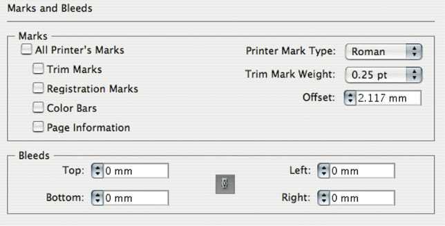
So we do not mean to start designing something if we have not set the dimension of the page, we have not put our internal boundaries and we have not set the blemishes. And this is true whether we are making a poster, or a magazine, or a simple card or a book. Bonds in a single-sheet must be on the 4 sides of a document, while in a booklet that is tied to lounges in the editing, it is enough to predict in 3 areas that we call top, bottom and out, because "inside" of the back, that is, we do not need to cut. Unless we talk about a magazine, for example, which will cut 4 and not 3 or a table spiral diary, where the wire, passing to tie the sheets, will occupy at least 10 mm from the edge of the sheet.
So it is very important, before we set up our document, to have spoken with our typographer and to agree on the correct dimensions of the document and especially on the blemishes we will put. Do you want a tip? With new design and layout programs, we can put as many bills as we want. Of these, when closing the file, we can only include what we need. Therefore, it is best to have more scratches from the beginning and do not need them, since we can cut them when exporting to pdf, rather than proving that we should use more shrinkage. A typical cut can range from 3 to 5 millimeters. Let's say, at least, that 5 is always covered, except in special cases where it may need more or less on occasion (eg a multi-page triangle with a pin or editing "chima-chima" on a typographic).
Therefore, checking the work, before it is sent, for the existence of correct cuts and, of course, correctly placed points cutting. Let's not forget that the crop marks must have an offset, i.e. a displacement from the edge of the paper, as many millimeters as our bleeds.
8. You want work without essay
Very often, either for reasons of ignorance, or for reasons of economy, or for reasons of speed, we avoid asking for a proof before printing. This, in some cases where we are really dealing with low-budget work, is partially justified. But how many times did we not design a "doulitsa" as "economical" as possible and when the doulitsa was printed instead of others we stepped on it? The only thing that can cover us and protect us is an essay. This is our color map with which we will be able to correctly reach the desired result. Besides, the customer's signature on the essay, contract proof, is also a legal proof, a contract and acceptance of the final result. It covers all in a nutshell if it is correct and if it is properly calibrated at the output.
9. No more, no less analysis
One typical mistake that one encounters is the wrong analysis that the images bring. An image must have neither a smaller nor a higher resolution than it should have. Everything starts with the quality of the paper or print material and the linear thickening density, ie lpi. A type that makes life easier is that the ppi of an image must be 2 times (or even only 1,5 time) the lpi in which our work will be printed.
For example, a newspaper printed on 90lpi needs images at 180ppi at most. Correspondingly, a coated paper that will be printed in offset on 150lpi will need at most 300ppi image resolution.
10. Do not avoid the transparency of truth
More and more often, due to the potential of modern design and layout programs, problems arise from poor and reckless use of transparency and lack of management. But things are very simple. Never transparency over text. So simple!
And if we do not even want our linear to be converted into bitmap, never complicated slides over linear ones.
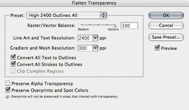
Every technology has some limitations and, by learning the capabilities of the tools we use, we also palpate the technological limits of a feature, such as the use of slides in a document.
To God, I am not trying to prevent the use of transparency. On the contrary. Transparency is not a problem when used properly and in moderation. When the pantone color is not involved in the slide and when there are no text under complex slides, then we have absolutely no problem. There are, moreover, transparency leveling mechanisms that will allow the document to reach rip and pass it normally.
Detailed instructions exist for any software you use to properly close your files in pdf.
4 more common problems after flattening a slide is to break a piece of text into linear contours, while another segment has remained normal, resulting in slightly thicker letters. The same can happen on lines that pass under transparency, resulting in a portion of a line being thicker than the rest. We also have the possibility to convert text to bitmap and finally to convert pantone colors to CMYK when submitted under complex slides. And here the right education - as in any other case - and communication with prepress is salvation.
