
While the Facebook is constantly changing in appearance, adding new features, or improving old ones, the logo of the social network is always the same. 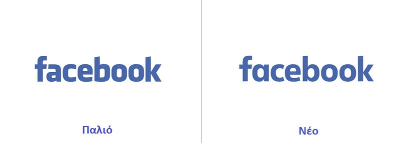
However, it seems that the company decided to refresh its appearance, without making dramatic changes. The simple old "facebook" no longer exists as we knew it, and apparently the font has become more discreet.
The most obvious change is the transition is to “a” from “a”.
Το ανανεωμένο λογότυπο του κοινωνικού δικτύου, διαθέτει περισσότερο λευκό και λεπτότερα γράμματα, πιθανώς σε μια προσπάθεια να γίνει το wordmark πιο ευανάγνωστο σε χαμηλότερες αναsolutions used by mobile devices.
Facebook's Josh Higgins said the company "aims to modernize the logo to make it more user-friendly and affordable."
You can see both Facebok logos on the slide below to compare the differences. 
Comparative transparency is from TheVerge.
