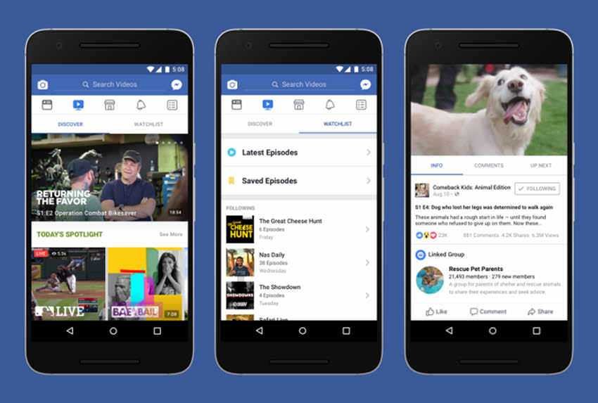
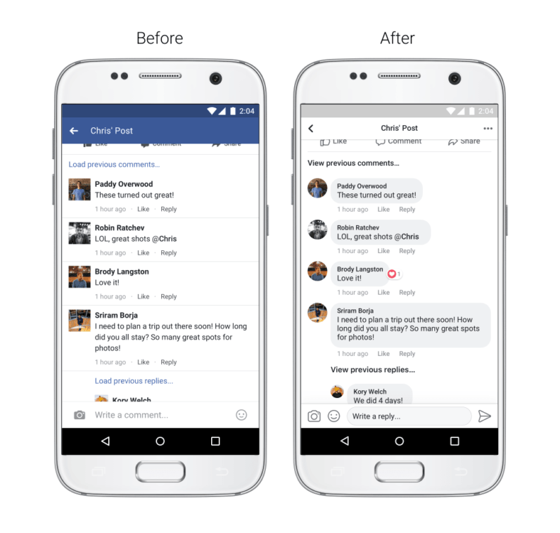
The applications for cell phones of Facebook they will acquire new look. The most obvious change it looks like it will take place in the comments, which will be much more like an ongoing discussion.
The new look is in line with the recent tests it performs on the Facebook UI, which show the comments as group conversations.
The idea is obviously to make comments a little more readable and to see more easily who is responding directly to another person.
Facebook may also be trying to make conversations with strangers a little friendlier. The similarity of the text box to those from a messaging app can make you feel like you have some personal conversation with participants, rather than replying to a random online thread.
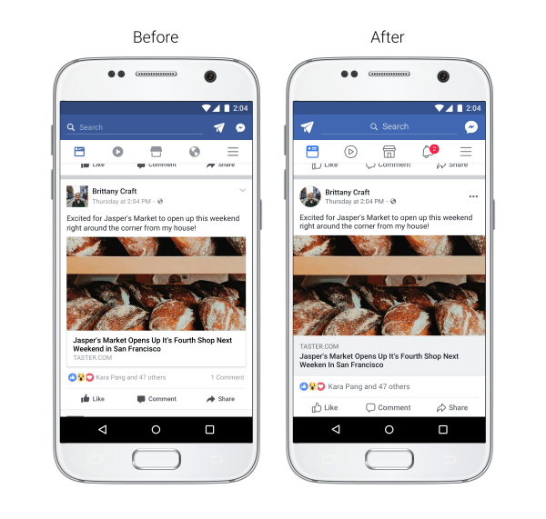
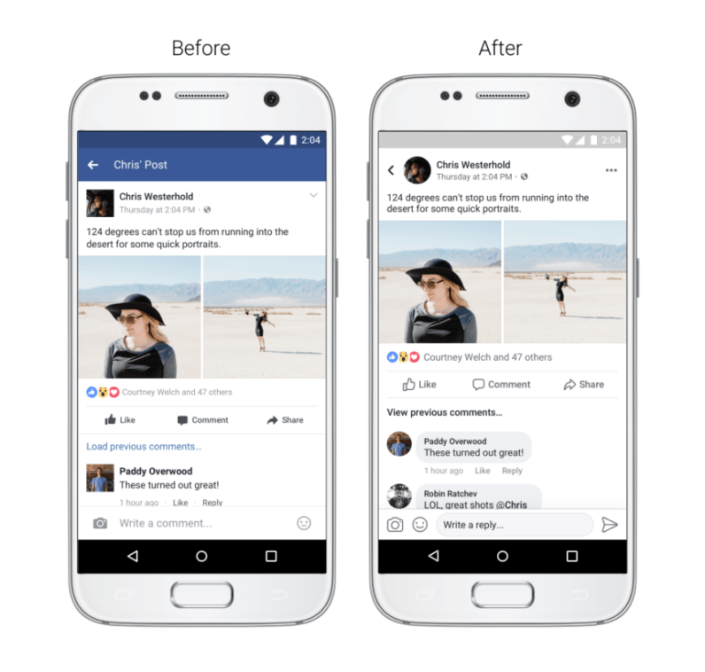
Less obvious will be the changes in News Feed.
Facebook will use a brighter shade of blue for a somewhat increased overall color contrast that will make the texts more legible.
The link previews are slightly larger (they will take up its entire width screen your) and the Like, Comment, and Share buttons will be somewhat larger.
As the official announcement about the upcoming changes of the largest social network seems to mention, there will also be many other small tweaks such as a more prominent button "back" but also the ability to see where a link will take you before clicking on it.
Facebook will release the new UI design "in the coming weeks."


