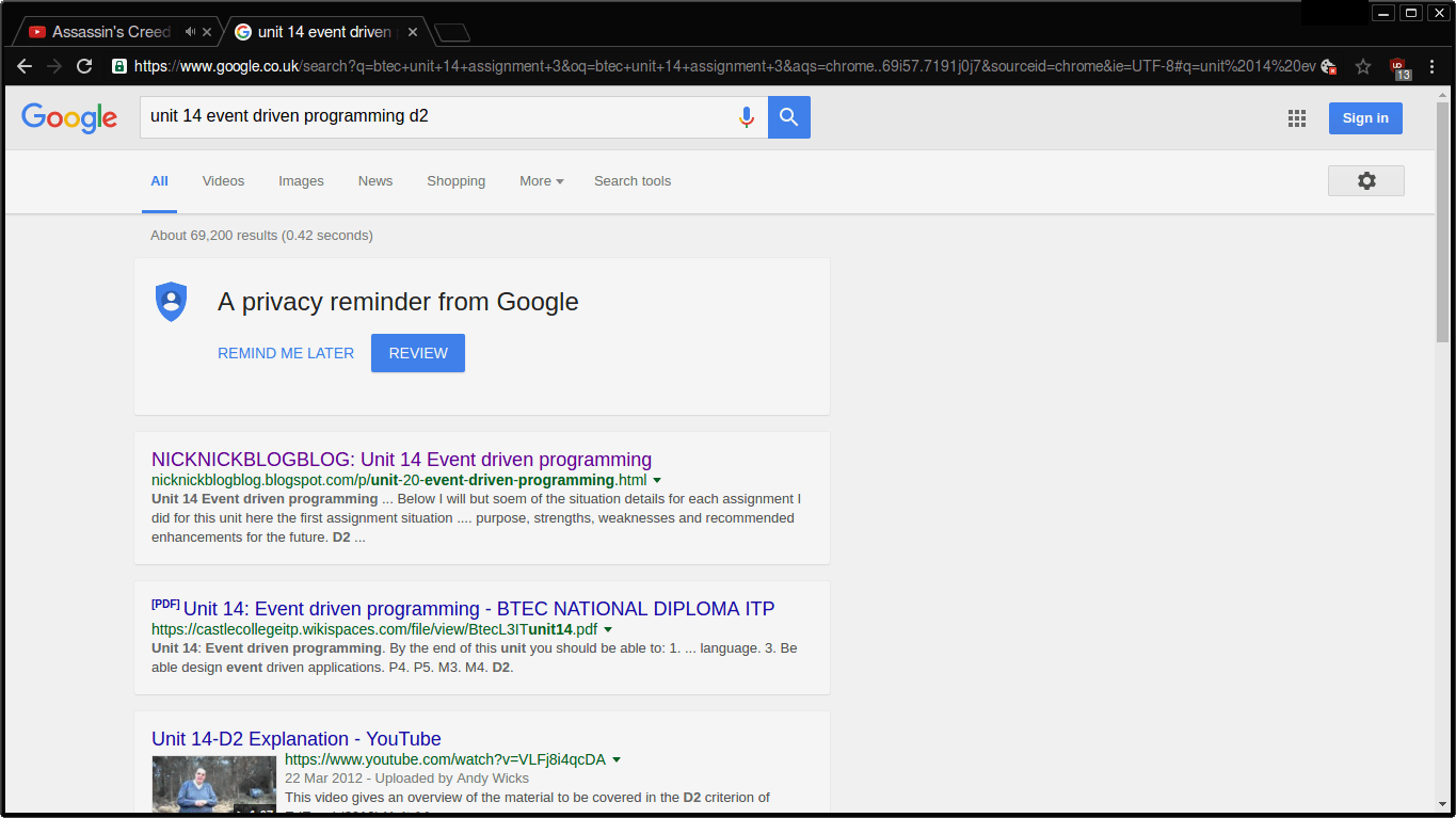
Material Design visually represents its identity Google, and it seems the company is trying to bring new changes to its biggest product: Google.com
Users from all over the web are reporting that their home page has been redesigned machineof search but also the results pages.
Instead of a series of blue connections in white background, each search result appears in its own white "card," and the background changes to light gray, like Google Now. 
The icon on the settings gear has also changed to the menu and looks more like the menu the company uses on mobile (three finesse).
The biggest change, however, is the information and advertising cards usually appearing on the right side of the results.
The new design integrates search results with ads. This means more space wasted, but it will be more likely for users to read the ads.
Of course the change is not dramatic given that the search results have kept the same basic look, blue and black text on a clean white background, but Google seems to change the pace somewhat.


