
Office 2018 Fluent design: Microsoft was one of the pioneers of flat design, but recently the company has evolved aesthetically into something a little more three-dimensional.
Last year, it unveiled its new approach, called Fluent design, adding depth, lighting, movement and more to its flat design. Fluent design has made slow strides in Windows, but now it seems to have progressed much more impressively in Microsoft Office as well.
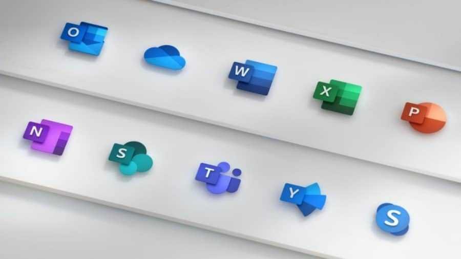
Welcome to the new Office logos:
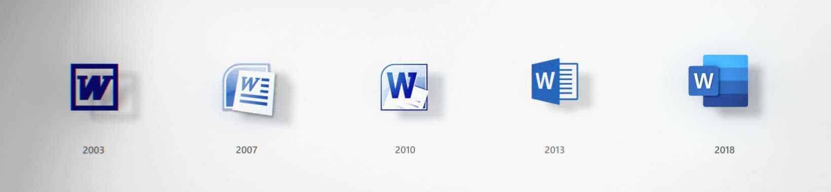
Office chief designer Jon Friedman tells Medium that Microsoft and the world have changed a lot since 2013, and the last time he redesigned the company logos.
Back then, selfies and emoji were new ideas, AI started popping up and it was even more likely that you would save your files locally than in the cloud.
The new logos reflect a more modern aesthetic, as well as the main orientations described in Fluent design.
particularly, according to the designer, are layered in a way that allows them to separate the letter from the accompanying symbol, adding a sense of depth “that creates opportunities in XNUMXD environments”.
The symbol is now larger than the letter because Microsoft wants to highlight the content you create more than the tool itself (ok eh?).
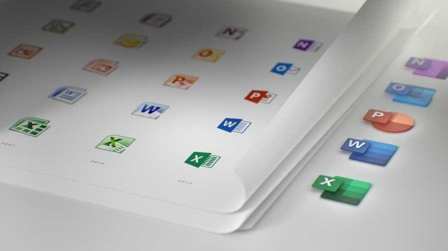
The new logos will be rolled out to apps in the coming months, but in the meantime you can read Friedman's philosophy for new designs at its publication on Medium but also see them below video.
_____________________
- Office; Tweak to protect against DDE attacks
- Old Facebook messages are randomly returned to users
- Ingestion LEGO: Who said that pediatricians have no humor
