
The Oxford Internet Institute has created a map which shows how countries will look like their borders have been reshaped by the number of users Internet.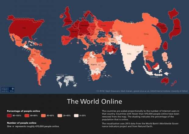
Ο χάρτης it is actually an updated one version of the previous World Online map from 2011, with the new data collected by the organization World Bank to show in detail the spread of the Internet on the planet until the end of 2013.
To better understand his map Oxford Internet Institute, you should know that it was built using hexagon tiles, each tile represents about half of the millions of internet users.
As you can see from the map below, the world will be completely different than it is today, but one thing is for sure, China and the US will still remain factories oftreatmentς ηλεκτρικού ρεύματος. Από την άλλη πλευρά, η Ρωσία έχει τους λιγότερους users of the Internet than Brazil and the India.
"46% of all Internet users live in Asia"
Also, the Oxford Internet Institute has pointed out that 46% of internet users worldwide live in Asia equals all users in Europe, Latin America, the Caribbean, North America, the Middle East and North Africa. This is not surprising given that most countries in another Akamai report show that many Asian countries are also among the top countries.
Ο χάρτης περιλαμβάνει επιπλέον τη ταχύτητα του Διαδικτύου σε κάθε κράτος. Όσο πιο σκούρο είναι το χρώμα, τόσο μεγαλύτερη είναι η ταχύτητα των πολιτών αυτής της χώρας. Εξαιρούνται μικρο-χώρες όπου έχουν σε εξέλιξη την υλοποίηση του έργου ανάπτυξης ευρυζωνικών υποδομών, τα μέρη όπου η έκδοση του Internet είναι μεγαλύτερη είναι όπου ο πληθυσμός έχει καλύτερες συνθήκες διαβίωσης. Αυτό σημαίνει ότι οι είναι ανεπτυγμένες χώρες, όπως οι ΗΠΑ, η Ιαπωνία, η Νότια Κορέα, η Αυστραλία και οι περισσότερες από τις χώρες της ΕΕ. Από την αντίθετη πλευρά είναι οι χώρες από την Ινδία, την Ινδονησία και τα περισσότερα από τα αφρικανικά κράτη.
See the map
Source: thegreeksenergy.com
