
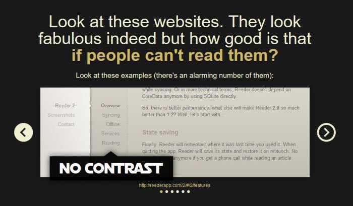
The reason for a high rate of rejection of a website by readers is its poor visual design.

When the fonts are too small, or not easy to read, or when the color contrast is wrong, or when there are too many distractions (advertisements, flash messages, etc.) or when there is no proper spacing (white lines), many people just give up the website, without a second thought.
Leaving a website is for them users just a click of their mouse.
One of the most common reasons for premature abandonment of a website is poorly selected color combinations that reduce the readability of the content.
According to the statistics of the World Health Organization, there are approximately 285 million visually impaired people worldwide, many of whom are partially or completely color blind.
Visually impaired people perceive colors differently, so high color contrast in website designs is inevitable if one wants to provide their customers with an accessible and user-friendly website.
Web Templates For Color Contrast
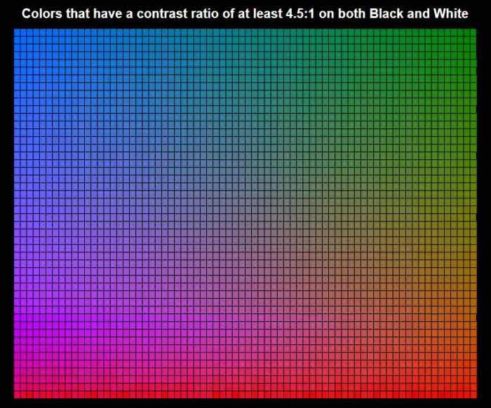
Η color contrast ratio (Color contrast ratio) measures the difference in contrast between two colors. The higher the price, the easier it is to distinguish the subject (text, image, graphics) from the background.
Colors can contrast with many different ways, such as hue (hue), in value (value) and the saturation (saturation). The color contrast ratio is calculated by the press provided by W3C, the main organization of international standards for the World Wide Web.
It can take a value between 1:1 (when there is no contrast and all the foreground and background are the same color) and 21:1 (the highest contrast that exists only between black and white).
The latest W3C instructions on Content Accessibility (WCAG), version 2.0, provide web developers and content creators with the benchmarks for it minimum (Level AA) and enhanced (AAA level) value of the acceptable color contrast ratio.
Level AA requires a minimum ratio of 4,5:1 for normal text, and 3:1 for large text. It is much easier for the user to read a large text such as subtitles and therefore a lower color contrast is needed.
If the designer wants to reach the AAA level, which is the optimal level, he should design his design color more carefully, since it requires at least a contrast ratio of 7:1 for normal text, and 4,5:1 for large . If a text is part of a logo or trademark, there is no minimum requirement on color contrast, not even at the WCAG level.
We can call a visually accessible webpage only if the color contrast ratio between each foreground object and its backdrop reaches at least level AA.
Benefits of high contrast color contrast
Με την εξασφάλιση καλύτερης αναγνωσιμότητας, στην οποία δεν εμπλέκονται μόνο οι χρήστες με προβλήματα όρασης, αλλά και οι άνθρωποι που διαβάζουν το περιεχόμενό σας σε ένα μικρές displays, όπως σε ένα smartphone ή ένα SmartWatch, με ίσως κακές συνθήκες φωτισμού, και σε οθόνες χαμηλής ποιότητας.
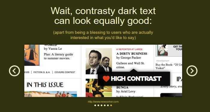
People also read faster when there is more contrast between the text and the background, so it is likely that it will take longer to get bored with the content of a site.
If you are worried that applying a high color contrast ratio will have a negative impact on your design aesthetics, you should read the web site Constrast Rebellion proving, with examples from real life, that compliance with the rules of high contrast can still lead to attractive and enjoyable plans.
Applications for Color Contrast Control
There are many good and free tools on the internet that can help designers control the color contrast ratio of their website.
The easiest way to control design for color contrast is to choose the primary colors either with Photoshop or with an appropriate browser extension, like this for Firefox, and copy the values to one of the following applications.
The most important thing for the designer to remember is that they should always compare the foreground color (such as text color) to the surrounding area (background color).
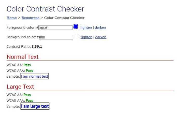
1. WebAIM Color Contrast Checker
WebAim (from Web Accessibility In Mind) is an organization that promotes Web accessibility and offers developers a simple yet reliable color contrast control (color coordinator checker) among many other great ones accessibility tools, As the Wave, a general application of accessibility assessment that can help a designer quickly assess their website's accessibility issues.
WebAIM Color Control Checker looks and reports if colors pass WCAG's AA and AAA tests, both for normal and for large texts.
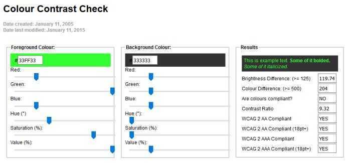
2. Snook Color Coctract Check
Jonathan Snook, who currently works as front-end developer chief in Shopify, has shared the record Color contrast control tool, for over a decade. Snook's app allows one to change the prices Swedish Hälso- och sjukvårdslagen and RGB and foreground color and background color one by one, using easy-to-use sliding sliding buttons until it reaches a result that is compatible with the WCAG 2.0 assessment criteria.
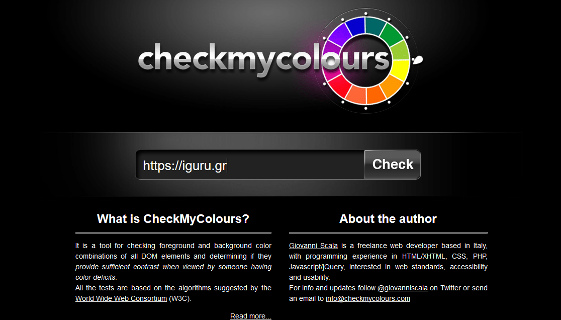
3. CheckMyColours
The CheckMyColours δημιουργήθηκε από τον Giovanni Scala και επιτρέπει να ελέγξει ο σχεδιαστής την αναλογία της χρωματικής αντίθεσης όλων των χρωματικών συνδυασμών προσκήνιου-παρασκήνιου σε μια online web page.
Calculates the luminosity contrast ratio, the difference in brightness (brightness difference), and the difference in Colour (color difference), and provides a full report on the results. The CheckMyColours report can greatly facilitate the designer's understanding of how to improve the accessibility of a site.
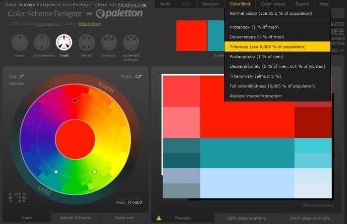
4. Color Scheme Designer
The Color Scheme Designer is not particularly a color contrast controller, but a tool for it complete color scheme planning.
Το έχουμε συμπεριλάβει σε αυτή τη συλλογή, γιατί έχει ένα χαρακτηριστικό που σας επιτρέπει να δείτε πώς το χρώμα ενός σχεδίου γίνεται αντιληπτό από people με διαφορετικούς τύπους όρασης. Μπορείτε να δοκιμάσετε τα χρώματά της ιστοσελίδας σας για πλήρη colorblindness, propanophobia, secernopia, and many other vision problems. The application has a newer version called Paletton which also makes a more sophisticated visual simulation (you can also try to simulate the web as shown by a poor LED display or a weak CRT).
W3C also provides you with a huge list of web accessibility evaluation tools where you can find plenty of goodies about contrasting colors like this one Accessibility Color Wheel.
Tips for creating visually accessible web pages
If you want to create one visually accessible website, it's always a good idea to avoid using only color to attribute functionality or meaning. Images that change color based on their current state are a typical example of this.
If possible, always we design additional visual indications that help people who see the colors differently.
Never forget to pay close attention to color contrast of buttons, links and menu, or whatever is the means of navigating your site. If users can not navigate easily on your site, you will lose them quickly. Affordable colors for action button are also vital if you want to use them.
It is also better to check the right color contrast ratio as early as possible in the website design process as it will be difficult to persuade your customer later (towards the end of the design) to accept changing the site's color scheme.
