
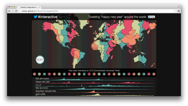
It's not exactly news that people sent tweets to say "Happy New Year" when 2014 arrived in their time zone, but the Twitter he's got make up a neat interactive imaging to show how the message spread around the world, in a variety of different languages.
This visualization offers a world map and a graph showing the frequency of each language over time. As expected Spanish, English and Arabic have the largest in duration views throughout the graph, as they are the three most spoken languages.
Greek has the 19th place, in relation to the total of 31 languages in the graph and it seems that the greeting messages sent except of the New Year in Greece was also throughout the New Year in the American continent. Apparently the Greek element is quite numerous there as well.
See the movement of Twitters "Happy New Year" worldwide
