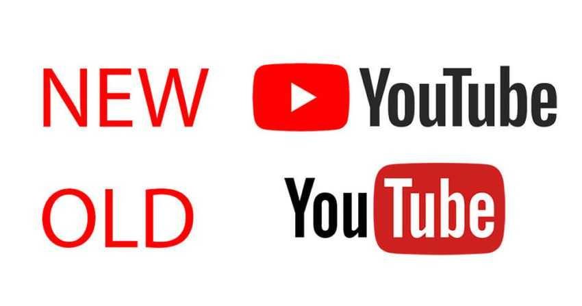
YouTube has changed its logo design. In fact, it is the first new company logo after 12 years.

The new logo does away with the classic design that had the word “Tube” in red background. Αντ ‘αυτού, το κόκκινο κουμπί play που προβαλλόταν ως το icon of the app now lives on the left of the logo. Its red color is also brighter.
It may be that our eye has become accustomed to the old mark for so many years, and it is difficult to accept the new one, which in our opinion has lost the eccentricity of the old design. Although it looks a little more monotonous, the company claims that change is more flexible for the plethora of devices and screens that are now on the internet. He believes that when the screen is limited (that is, a smartphone), you can use the Play icon as an abbreviation of the logo, which will be easier to read and be more clearly read.
His new logo YouTube, appeared on mobile and desktop today, and will be coming to others as well applications and "coming soon" services.
In a corresponding video presentation, the company says that in addition to changing its brand,and adds new possibilities. Allows longer dark backgroud for better viewing, and reptreatment with adjustable speed at mobile. See the relevant video below:


