
It is no secret that we are destroying the environment and transforming our planet. It is different, however, to mention it abstractly and differently to see it happen globally.
Below are some maps published this month in the International Journal of Applied Earth Observation and Geoinformation.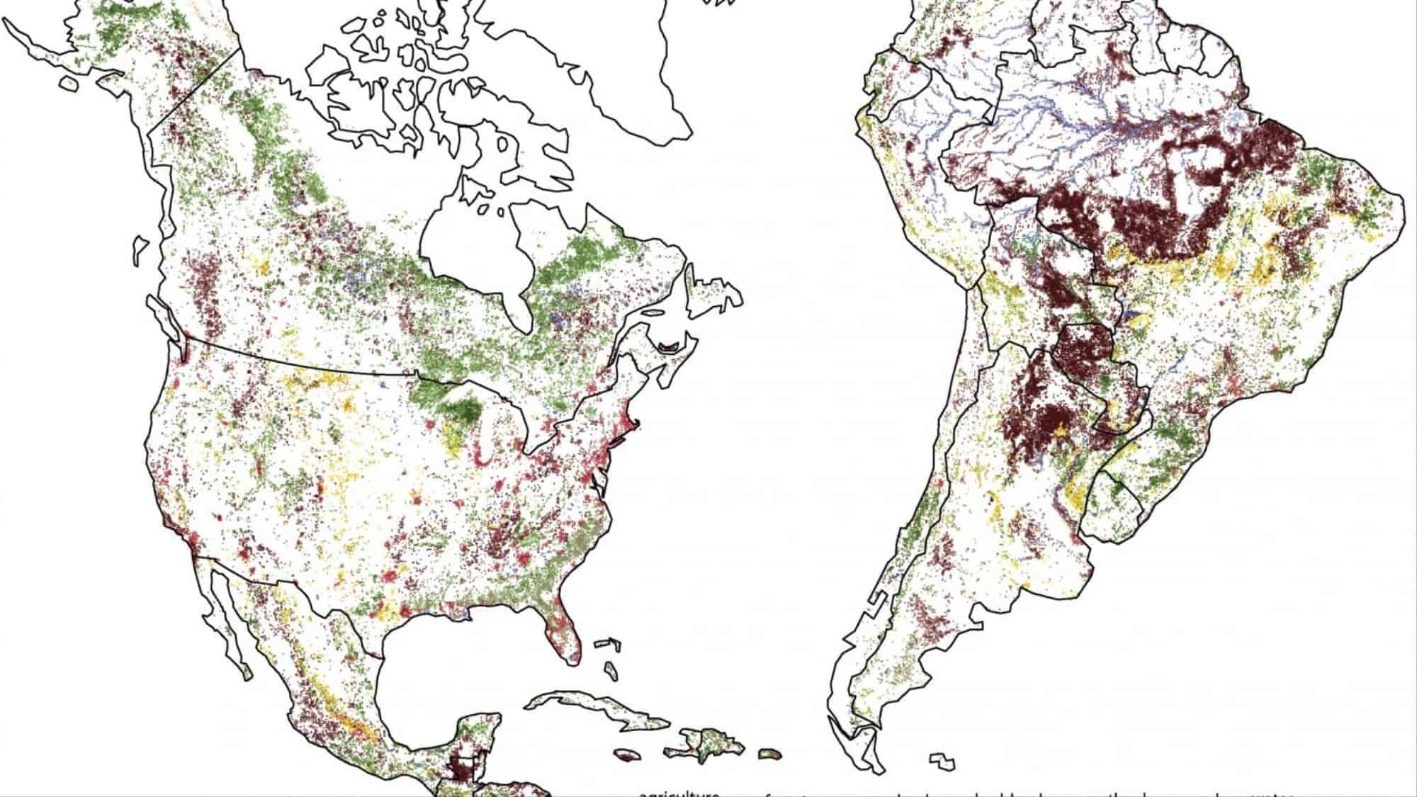
It was developed by geoscientist Tomasz Stepinski and team of the University of Cincinnati Space Informatics Laboratory (SPI). The complex visualizations reveal that 22% of the total land area of the earth changed between 1992 and 2015, mainly by humans.
The most common change is forest loss due to agricultural development, and the second most common is from forest exploitation.
Stepinski and his colleagues used satellite data collected by the European Space Agency's Climate Change Initiative, which includes geographic maps of the earth designed to monitor climate change.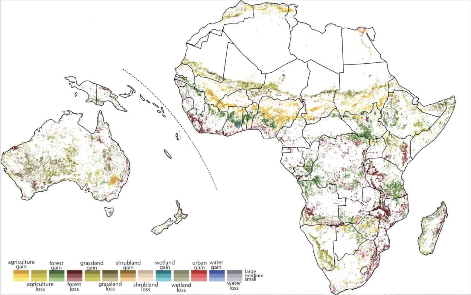 Motherboard images
The team divided these maps into 81 square meters and created colored tiles depicting nine broad types of changes that took place between 1992 and 2015 (agriculture in yellow, forest losses in coffee, etc.).
The shading of the tiles reflects the degree of change, with the lighter shade reflecting smaller changes (areas have changed less than 10 percent) while darker tiles represent areas that have changed by 30 percent or more.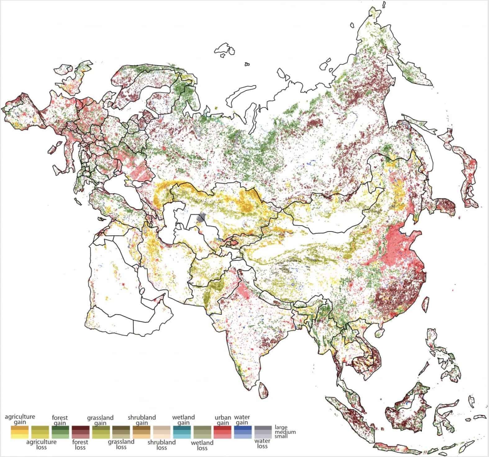
On a large scale, the maps highlight the enormous impact of human activity on the planet. But the project also reveals some very bad details in some locations.
The gray color and disappearance of Lake Aral (Aral Sea on the Kazakh-Uzbek border), has been created due to the disturbance of its tributaries by irrigation works.
Forests in the interior of China, West Africa and much of the Russian taiga appear in dark green. The astonishing rate of deforestation in southeast China and the massive urbanization of northeast China, represented in brown and pink respectively, are astounding.
"I had two goals," Stepinski said, describing his intentions with the maps.
My first goal was not scientific but for people to see and realize what is happening.
The second goal was to create a manual. The map is not the end for scientists, it is the beginning. They can see it and spot places that seem to be changing. So they can focus on specific areas and do more research.
__________________________
- Windows 10: why are we all Insiders?
- MIT gives 1 billion dollars to open a college only for AI
- App on Facebook tried to do last?
