
In November of 2018, Microsoft unveiled a renewed line of graphics it had created with the new Fluent Design aesthetic for Windows 10 and beyond.
In December of 2019, announced that it had Fluent redesigns for all Windows 10 icons. Starting yesterday, the company started rolling out some of these icons, starting with Windows Insiders.
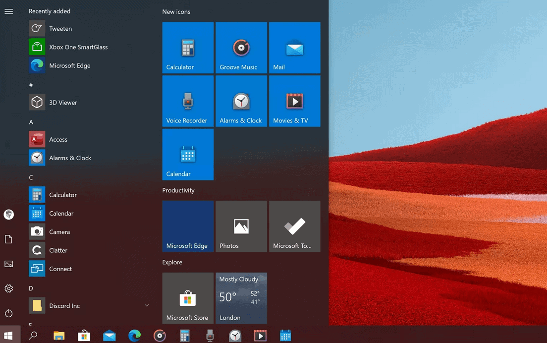
The first applications to get a new look include Calculator, Groove Music, Mail, Voice Recorder, Alarms & Clock, Movies & TV, and Calendar, according with The Verge, and more will follow.
The old Windows icons have been around for years, and even when Microsoft began adopting the minimalist pictograms of the Metro design era, it did not redesign all the Windows icons, leaving us with the old ones.
Fluent Design was presented for the first time at the Microsoft Build 2017 conference, showing us an interesting new stylistic direction of the company. Combines all elements of lighting, motion, depth, material and scale and creates customizable elements that work on various devices (computers, phones, TVs, VR).
The last video Microsoft's promotion for its new unified application Office it gives you a good idea of the aesthetic direction the company is going.
Microsoft has promised to change all Windows 10 icons, so it's only a matter of time before the process is complete.
