Η searching machine Bing απέκτησε ένα διαφορετικό λογότυπο, καθώς η Microsoft συνεχίζει τις αλλαγές στα icons her.
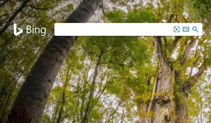
Microsoft is testing a new logo for the machine Bing search. It's already live and you can see it on its home page.
The new logo has no sharp sharp corners, looks more three-dimensional and looks more natural. On the results page of a search it looks even better as it appears in dark grey Colour on a white background.
The truth is that the new logo is more attractive, compared to the old neural variant.